Glad Tidings Lemonade Co.Case study
See the live site

Case study · A Rheanbow concept brand

Glad Tidings Lemonade Co.

A lemonade food truck brand built around one grumpy lemon, a cast of six, and a scroll film where sour turns glad.

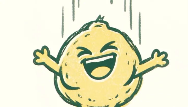
The homepage film. On the site it plays as you scroll.

The brief

A truck that has to sell in three seconds.

A lemonade truck parks in a row of other trucks, and people decide where to walk in a few seconds. The same brand has to work on a phone, where most people find out where the truck is parked this weekend. It also needs to book private events, which is where a food truck makes its steadiest money.

So the brand had to be easy to spot from across a parking lot, with a menu you can read without squinting. And people had to remember it and come back.

The idea

Sour goes in.Glad comes out.

Every cup starts with a lemon that would rather not. The mascot, Big Squeeze, starts the story grumpy with his arms crossed and ends it grinning in a cup. The logo, the menu, the film and even the footer tell that same small story.

The name

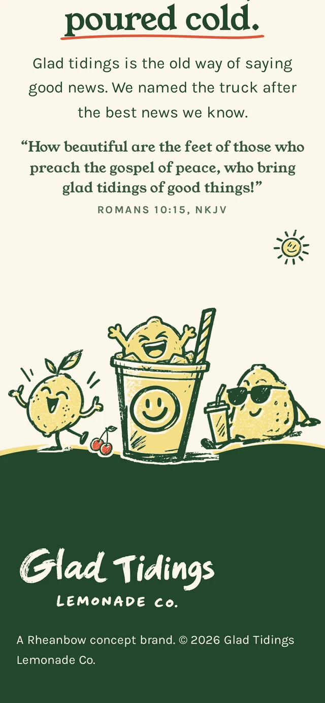
Good news, poured cold.

Glad tidings is the old way of saying good news. The name carries the faith behind the brand quietly, the way a church picnic does. The one place it is said out loud is the footer of the site.

“How beautiful are the feet of those who preach the gospel of peace, who bring glad tidings of good things!”Romans 10:15, NKJV
Logo suite

Level, then loud.

The lettering started as loose brush work on a sketch sheet. It was leveled word by word and set on the bowls of the round letters so it reads at a glance, while the brush tails keep their bounce.

PrimaryGlad Tidings Lemonade Co. primary horizontal logo in green with a butter offset
StackedStacked Glad Tidings logo
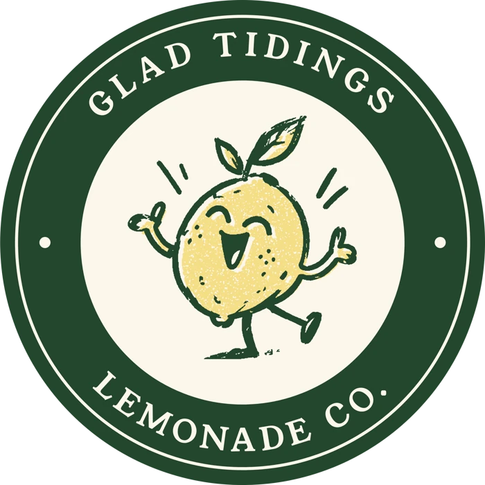
SealRound Glad Tidings seal with a leaf-green ring and Sunny in the center
MonogramGT monogram
ReversedCream Glad Tidings logo on green

Every lockup ships in green, cream and a two-ink print version, as SVG and 3000px PNG, so it can go straight onto cups, sleeves, stickers and signs.

Color and type

Two inks and a paper.

Leaf green does the drawing and the words. Butter does the filling. Cream is the paper under everything. Tomato shows up only where a little extra joy belongs: the cherries and one underline.

Leaf Green#23462CLine, lettering, text
Butter#F5DE86Fill plate, printed a touch off
Cream#FBF6EAThe paper
Tomato#E0553AAccent only
The word Glad from the logo, printed in green with the butter plate set slightly down and to the right

Never perfectly lined up.The butter always sits a few points down and to the right of the green, like a real two-color print pulled by hand, which keeps the brand from looking like clip art.

Young Serif

Headlines and menu names. Round and sturdy with a bit of old-fashioned charm, like a hand-painted price board.

Karla

Everything you read. A friendly grotesk that stays easy to read on a phone, never set smaller than 16px on screen.

The cast

Six lemons, six moods.

Each character has one mood and one job. They are drawn in the same two inks as the logo, so they look like they belong on the same cup.

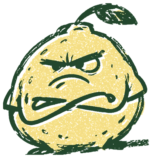
Big Squeeze, a round grumpy lemon with crossed arms
Big SqueezeThe sour one. Star of the film.
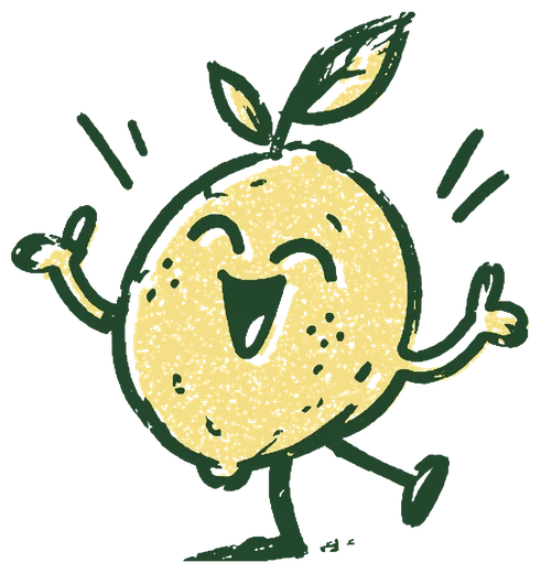
Sunny, a dancing lemon
SunnyFirst to dance.
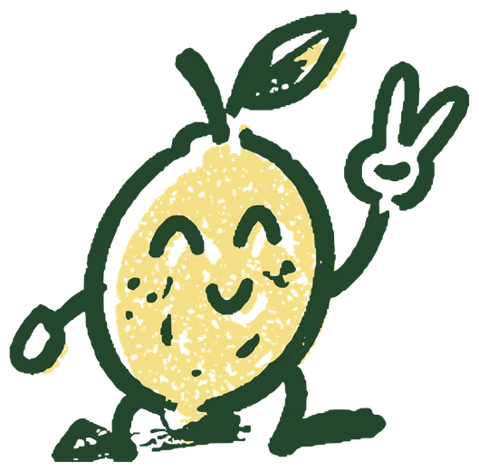
Pucker, a lemon giving a peace sign
PuckerPeace sign, always.
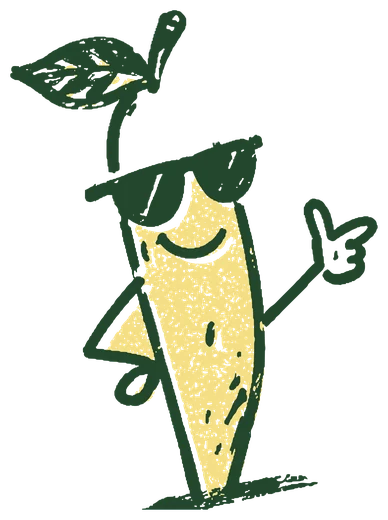
Sour Sam, a tall lemon in sunglasses
Sour SamCool about it.
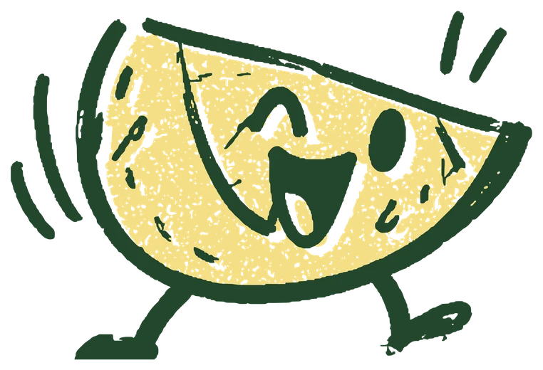
Zesty, a running lemon slice
ZestyLate, running.
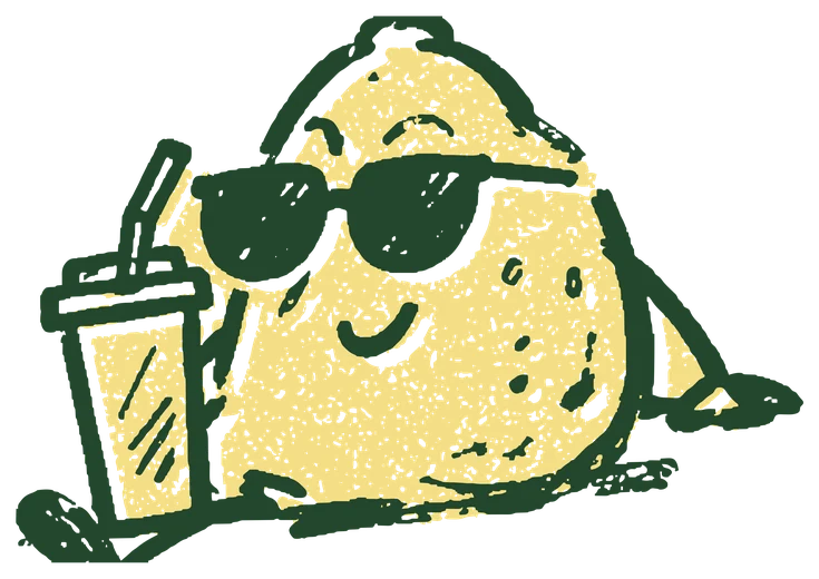
Sweet Tea, a lemon lounging in sunglasses with a cup
Sweet TeaOff duty.
Event hosts

Each booking package has a host peeking over the ticket: Sunny for Porch Party, Big Squeeze for Block Party, and the rest of the crew for The Whole Town.

The footer crew

The whole cast gathers on a hill at the bottom of the site. Tap anyone and they say something in character.

Big Squeeze, everywhere

He stars in the film, and he pops up grinning in a cup when someone books the truck. Sunny holds the seal on every cup.

Supporting graphics

The truck, in pieces.

A set of hand-drawn icons for menus, sleeves, stickers and social posts, plus a half-drop pattern for cup sleeves, bags and tissue paper.

Lemonade cup icon Lemon pitcher icon Soft pretzel icon Cherries icon Smiling sun icon Good Sips punch card icon Fresh badge Ice cubes icon Splash icon Heart icon

The film

One fall, start to finish.

The homepage is a single shot. As you scroll, Big Squeeze drops from his branch, meets the sun, cracks a grin and lands in a cup. The camera only ever falls, so scrolling down always moves the story forward.

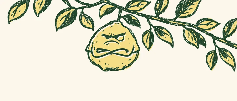
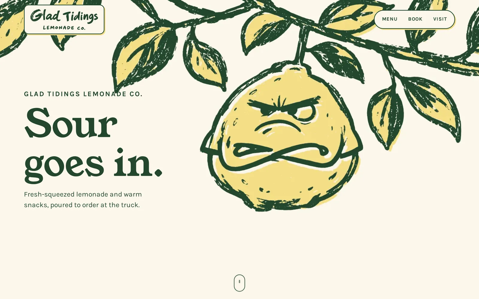
Big Squeeze hanging from a branch, arms crossed
Grumpy on the branch
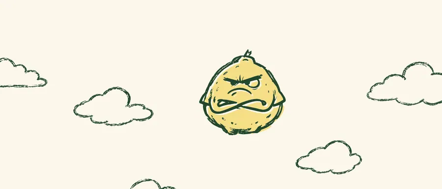
Big Squeeze falling past clouds, still grumpy
Still grumpy, now falling
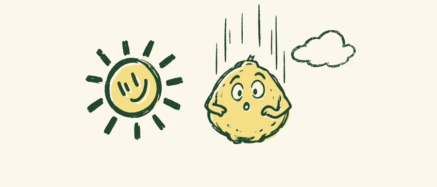
Big Squeeze surprised by a smiling sun
The sun comes out
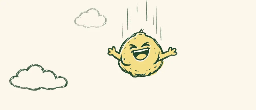
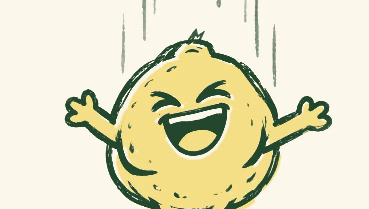
Big Squeeze laughing with arms open
He cracks
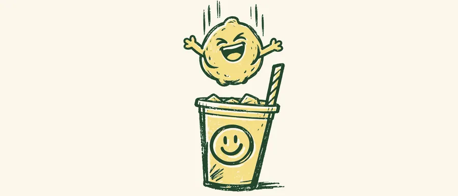
Big Squeeze above a smiling cup of lemonade
The cup rises to meet him
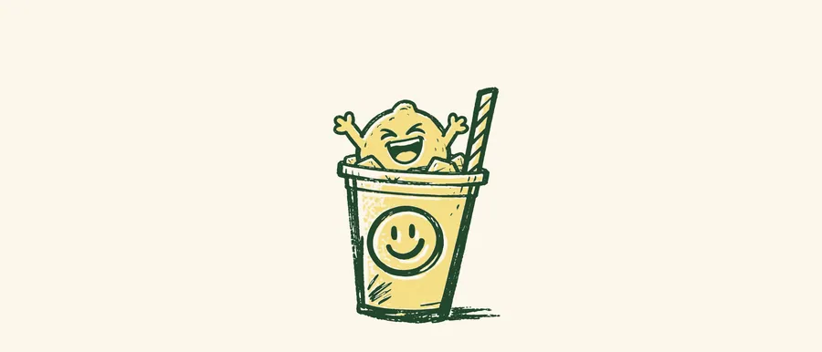
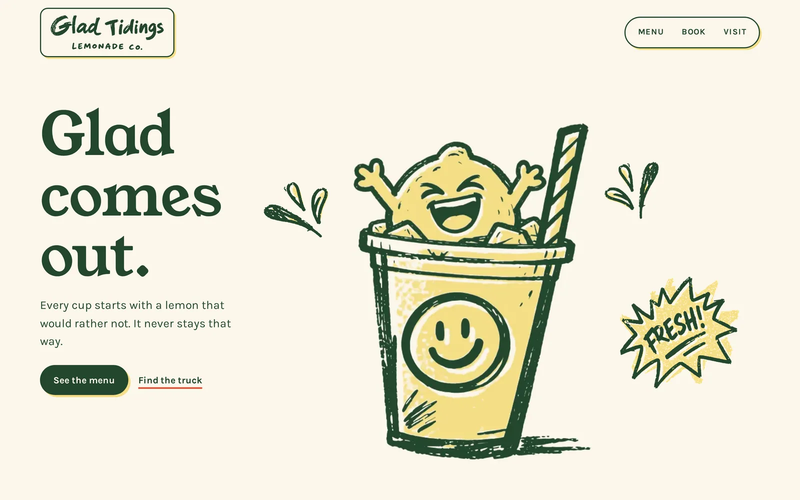
Big Squeeze grinning inside the cup
Glad comes out
  1. Six keyframes

    The story was drawn as six stills first and approved one by one before any video was made.

  2. Widened for desktop

    Each still was extended to a 21:9 frame so the film fills wide screens without cropping the lemon.

  3. Five linked clips

    Each clip starts on the real last frame of the one before, so the fall never jumps.

  4. Re-inked

    Every frame was redrawn into the two brand inks, so the film matches the logo exactly.

  5. Played by scroll

    484 frames play as you scroll. On phones the frame follows the lemon and fades into the page.

A raw video frame of Big Squeeze with pale, washed-out colors
Before. Raw frame from the video model. The greens drift and the paper turns gray.
The same frame re-inked in the Glad Tidings green and butter on cream
After. The same frame on the brand plates: leaf green line, butter fill, cream paper.

In the world

Real cups, real light.

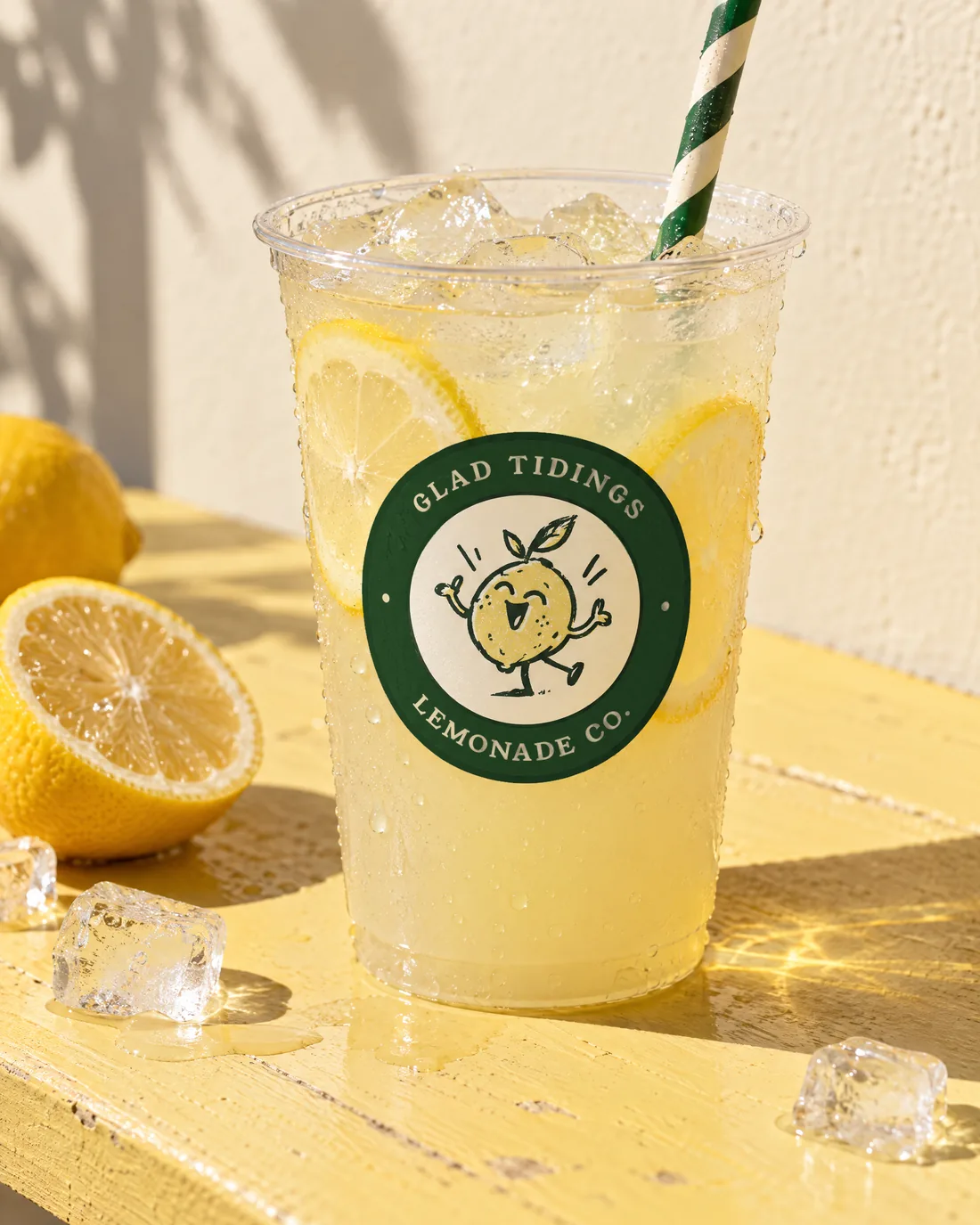
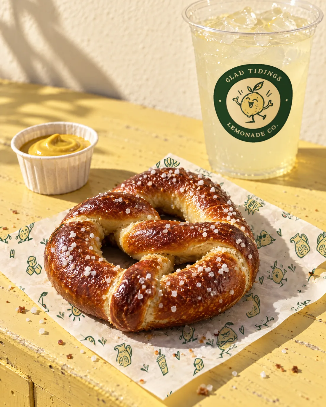
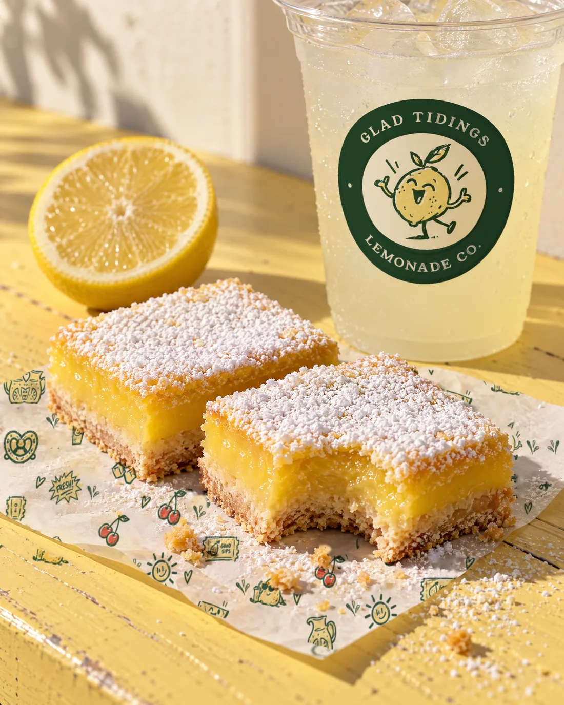
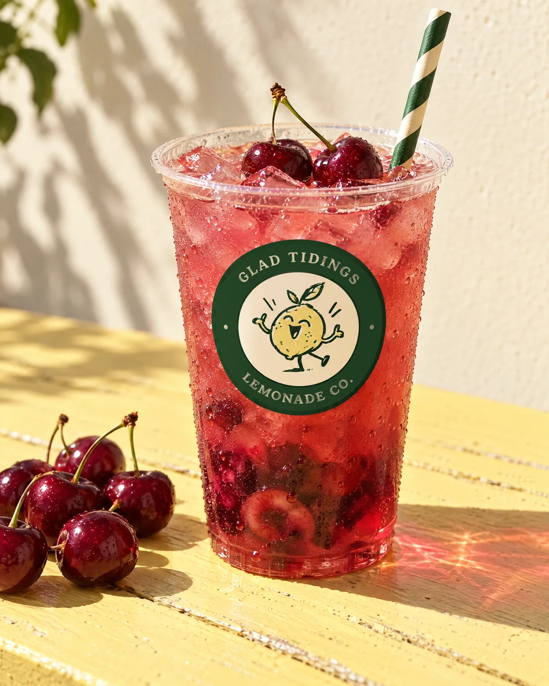
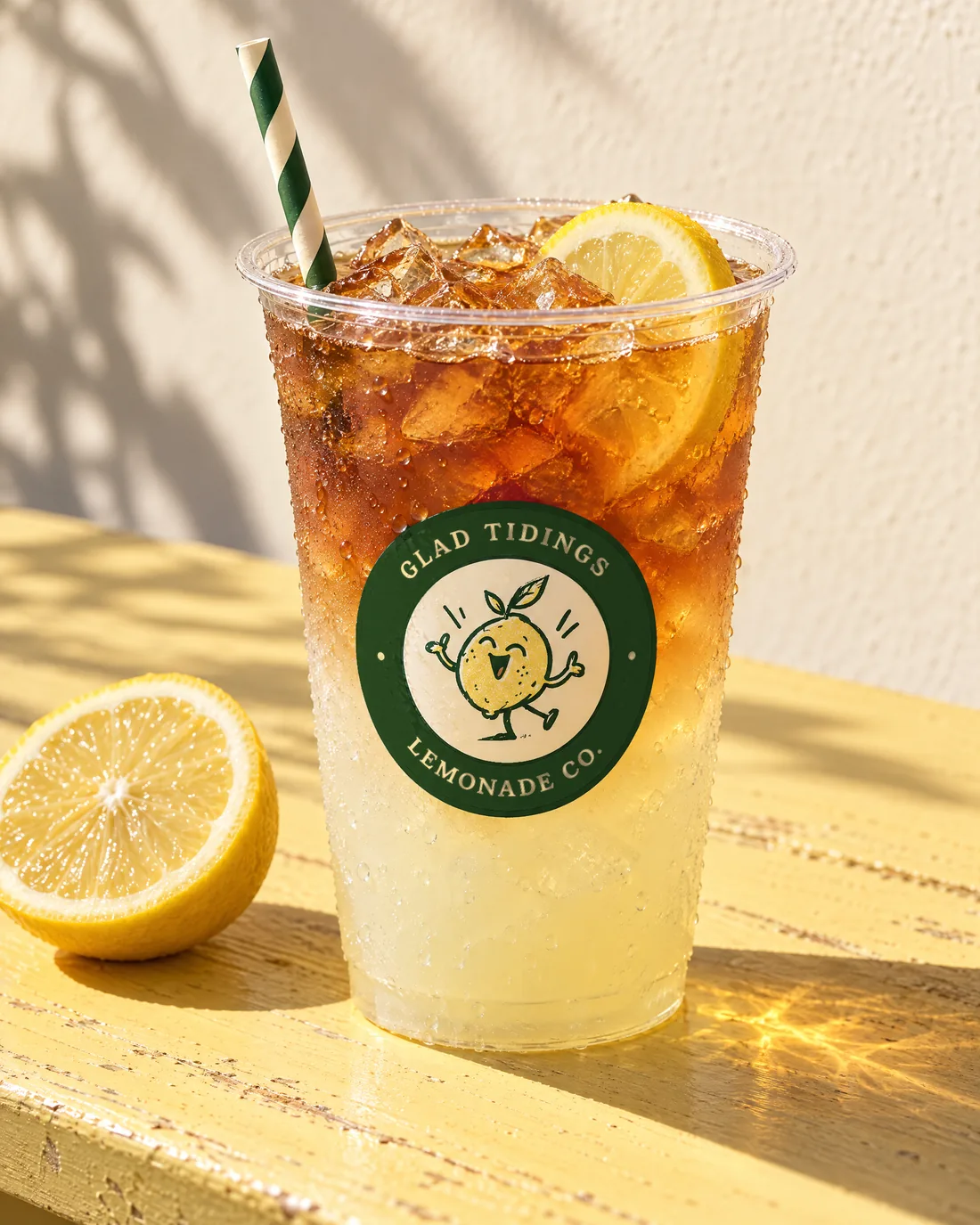
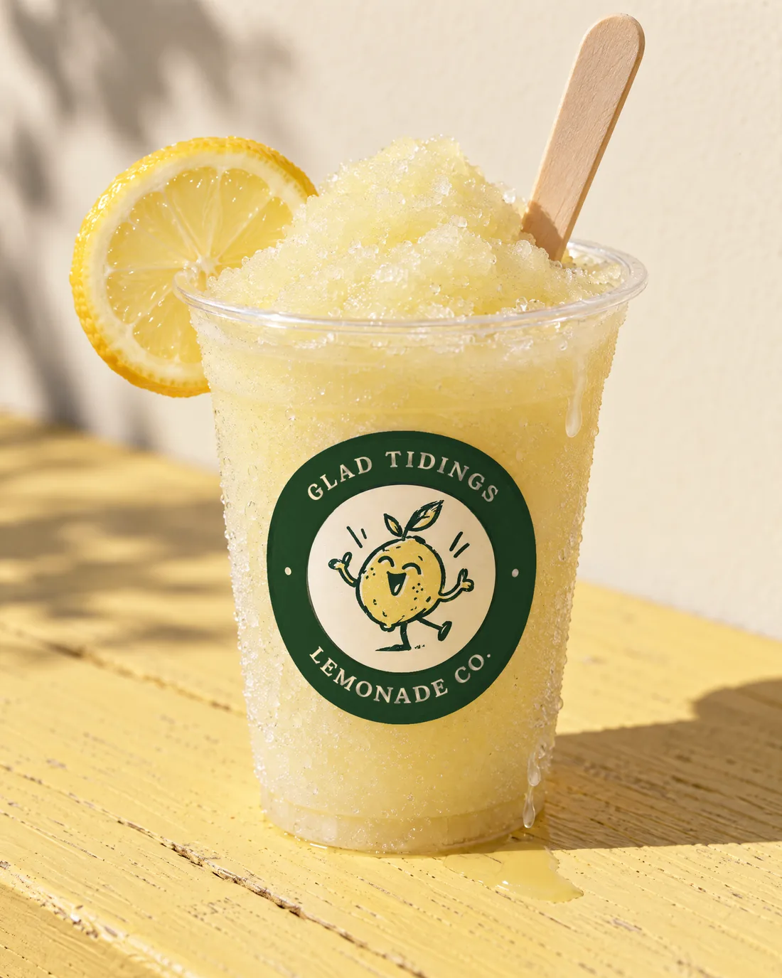
Product photography for the menu, directed to feel like a sunny afternoon at the truck: hard shadows, wet ice, the green-ring seal on every cup so it stands out against the lemonade.

Classic lemonade with lemon wheels in a clear cup with the Glad Tidings seal
A salted soft pretzel on patterned wax paper beside a cup
Powdered-sugar lemon bars on patterned paper
Cherry lemonade with fresh cherries
Half lemonade, half sweet tea over ice
Frozen lemonade piled above the rim
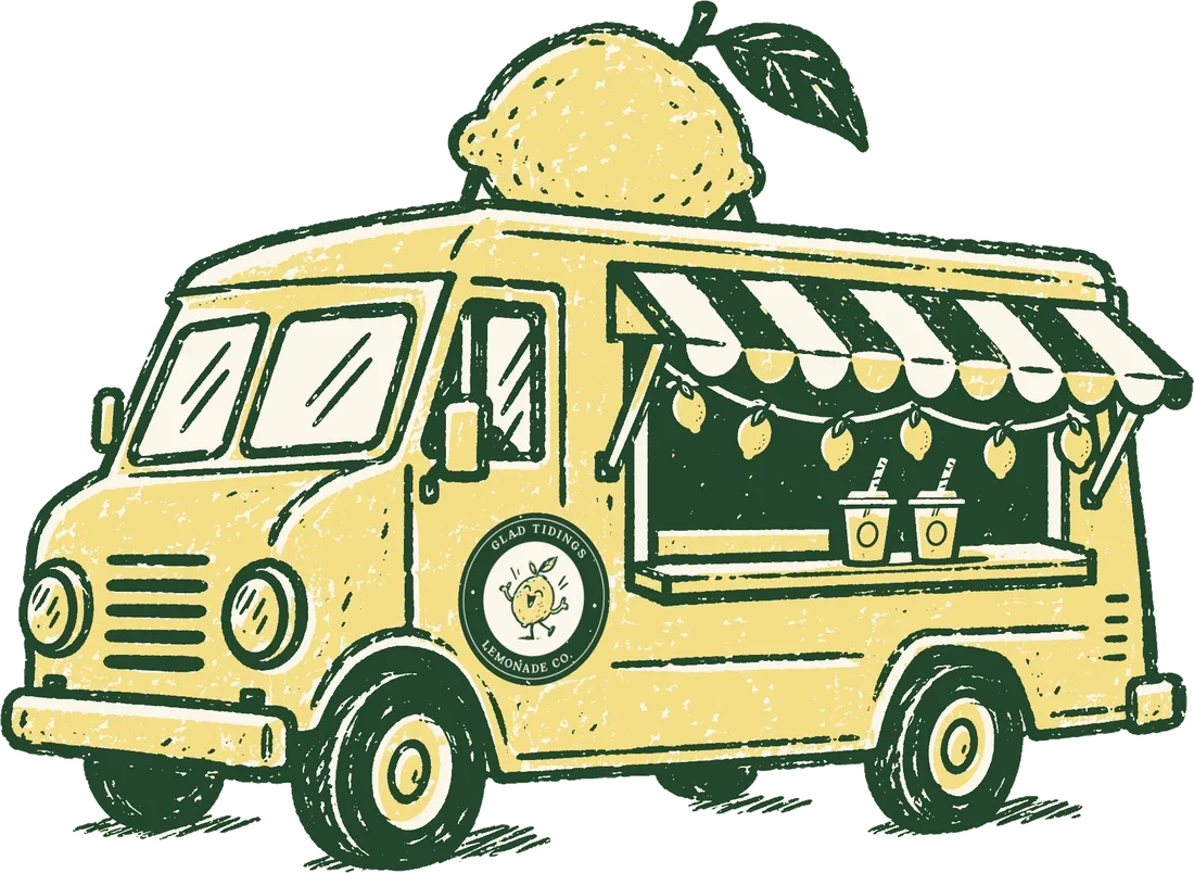
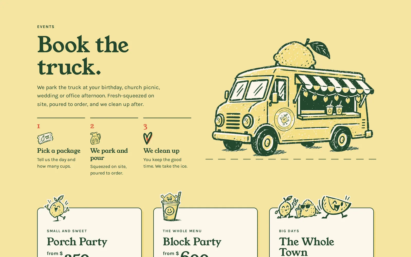
The Glad Tidings truck: a yellow step van with a giant lemon on the roof, a striped awning and the green-ring seal painted on the side

The truck itself.

A yellow step van with a giant lemon on the roof, a striped awning and the seal painted on the side. On yellow, the seal switches to its green ring so it never disappears. It anchors the Visit section and gives the brand a real place to live.

The website

A story you scroll, then a menu you can read.

The film opens the site, then everything a customer needs follows in order: what’s on the menu, how to book the truck, and where it parks this weekend.

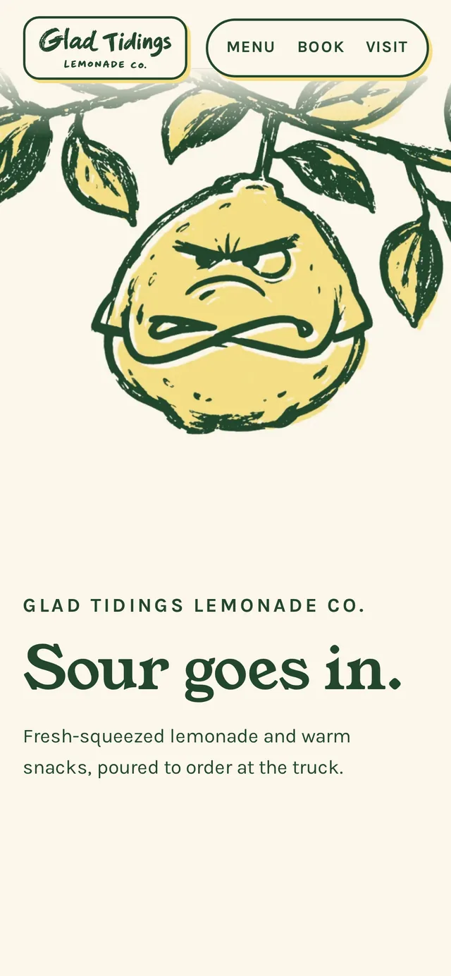
Homepage opening: Sour goes in, with Big Squeeze hanging grumpy from a branch
The openingBig Squeeze sways on his branch and glances around while he waits for you to scroll.
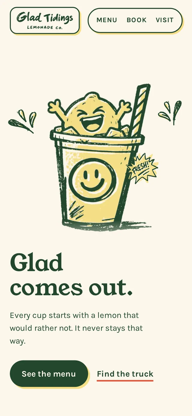
End of the film: Glad comes out, with Big Squeeze grinning in a cup and a Fresh badge
The landingThe film ends in the cup with a splash, and the call to action arrives with it.
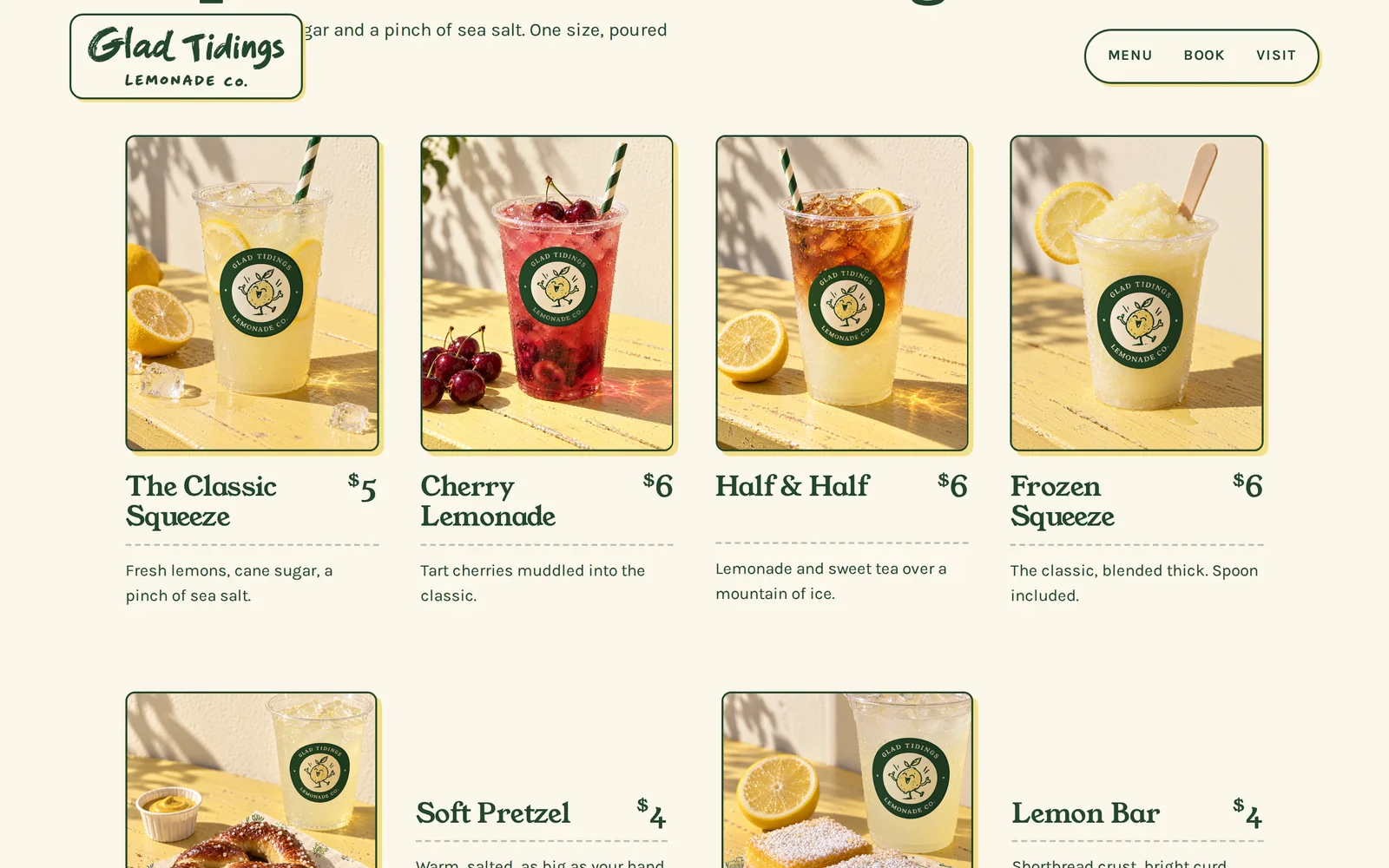
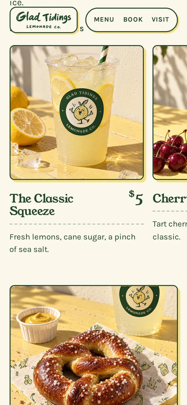
Menu section with four drink photos, names and prices
The menuBig photos, a name and one clear price for each drink.
Three event packages as ticket cards, each with a lemon host peeking over the top
Book the truckThe truck drives in, and each package is a ticket. Tap one and it fills in the booking form for you.
Phone view of the homepage opening
Built for phonesThe film follows the lemon on a tall screen.
Phone view of the film ending
Clear callsMenu and truck, one tap each.
Phone view of the drinks as a swipe row
Swipe the drinksA short row instead of a long stack.
Phone view of the footer crew standing on two hills
The crewEveryone stands on the hill, and anyone will talk if you tap.

Brand sheet

Everything on one page.

The full brand sheet: logo suite, inks, type, cast, graphics, pattern and the brand in the world. Scroll inside the frame to see all of it.

The Glad Tidings brand sheet showing the logo suite, colors, type, cast, supporting graphics, pattern and the brand in the world

Brands with a story and a cast.

Rheanbow designs brand identities, custom websites and the characters that live in them, for businesses that want to be remembered.